Creating a home that feels peaceful and relaxing often starts with the colors you choose for your walls and furnishings. Calm colors have the unique ability to soothe the senses, reduce stress, and create a welcoming environment. Whether you’re repainting a single room or redecorating your entire home, picking the right color palette can make a big difference in your everyday comfort and mood.
In this blog post, we’ll explore practical tips for choosing calm colors, how to combine them, and which shades work best for different spaces. Let’s dive in!
Why Choose Calm Colors?
Calm colors are typically soft, muted tones that evoke a sense of tranquility and restfulness. They help create spaces where you can unwind after a busy day or focus on tasks without distractions. Unlike bright or overly saturated hues, calm colors tend to be easy on the eyes and foster a peaceful atmosphere.
Some benefits of using calm colors in your home include:
– Reducing stress and promoting relaxation
– Enhancing focus and concentration
– Making small rooms feel more spacious
– Creating a timeless and elegant look
Popular Calm Colors and Their Effects
Here’s a quick overview of some common calm colors and what feelings they often inspire:
– Soft blues: Often associated with the sky and water, blues are known for their calming and cooling effect.
– Muted greens: Reminiscent of nature, green provides balance and a refreshing vibe.
– Warm neutrals: Shades like beige, taupe, and soft gray add warmth without overstimulation.
– Pale lavenders: A gentle purple shade that can feel soothing and uplifting.
– Dusty pinks: Subtle pinks offer warmth and comfort without being too vibrant.
Tips for Choosing Calm Colors
1. Consider Your Space and Its Purpose
Think about how you use each room. Bedrooms, bathrooms, and reading nooks often benefit the most from calming hues. For living rooms or workspaces, balance calm colors with energizing accents to maintain a lively feel.
2. Test Colors in Different Lighting
Colors can look very different depending on natural and artificial light. Paint sample patches on your walls and observe how they change throughout the day. This helps ensure your chosen color remains soothing in all lighting conditions.
3. Use a Limited Color Palette
Stick to two or three main calm colors for each room to avoid visual clutter. Choose complementary shades that blend well together to promote harmony. Avoid mixing too many bold or contrasting colors if your goal is a peaceful space.
4. Combine with Natural Materials
Pair calm colors with natural textures like wood, stone, or cotton to enhance the serene atmosphere. Natural materials add warmth and depth without detracting from the restful vibe created by your color choices.
5. Don’t Forget the Ceiling and Trim
Often overlooked, ceilings and trim painted in soft, calm colors can enhance the overall balance. Consider off-white or very light tones that complement your walls without drawing too much attention.
6. Use Accent Colors Sparingly
If you want a little brightness, use it in small doses through cushions, artwork, or decor items. Accent colors can highlight your main calm palette without overwhelming the serene ambiance.
Avoid These Pitfalls
– Choosing colors that feel too cold or sterile, such as harsh grays or icy blues, unless balanced with warm textures.
– Picking trendy colors without considering how you feel about them long-term.
– Ignoring the finish of your paint—matte or eggshell finishes enhance calmness better than shiny ones.
– Relying solely on paint color; fabrics, lighting, and furniture also play important roles.
Best Calm Colors by Room
Bedroom
Soft blue, sage green, or pale lavender create a restful sanctuary. These shades promote relaxation and help regulate sleep.
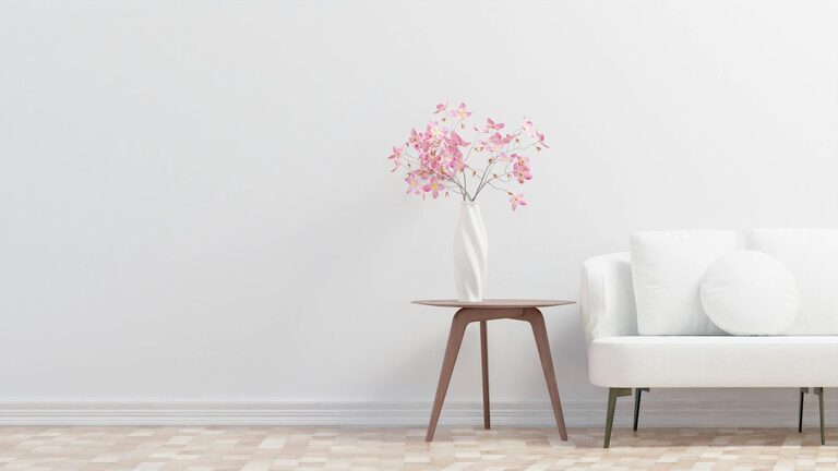
Living Room
Neutral tones like warm beige or light gray paired with soft green accents create an inviting but calming area for socializing and relaxation.
Bathroom
Light aqua, soft gray, or even dusty pink evoke cleanliness and tranquility, making bathrooms feel spa-like.
Home Office
Muted blues or green tones help improve focus without causing visual fatigue during work hours.
Final Thoughts
Choosing calm colors for your home is about creating a space that reflects your personal style while fostering peace and relaxation. By paying attention to the function of each room, lighting, and complementary materials, you can select colors that make your home a comfortable retreat.
Start with small changes like repainting a wall or swapping cushions for calm-colored options, and notice the difference it makes in your mood and comfort.
Happy decorating!